Credit Union Travel
Heading 3
Lorem ipsum dolor sit amet, consectetur adipiscing elit, sed do eiusmod tempor incididunt ut labore et dolore magna aliqua. Ut enim ad minim veniam, quis nostrud exercitation ullamco laboris nisi ut aliquip ex ea commodo consequat. Duis aute irure dolor in reprehenderit in voluptate velit esse cillum dolore eu fugiat nulla pariatur.
Heading 1
Heading 2
Heading 4
Heading 5
Heading 6
Block quote Block quote Block quote Block quote Block quote Block quote Block quote Block quote Block quote Block quote Block quote
Ordered list
- Item 1
- Item 2
- Item 3
Unordered list
- Item A
- Item B
- Item C
Bold text
Emphasis
Superscript
Subscript

Client
industries
services
The Problem
Most Credit Unions, viewed as “old school” by younger generations, have long been associated with trust and stability…but also with geriatrics.
For the younger generations, Credit Unions are outdated. They are irrelevant for travel and only applicable to their parents.
For Credit Unions to succeed with a younger generation, they need to reintroduce themselves completely. CU Travel saw an opportunity to put two things together that would do just that. There was a better story to be told that would appeal to a wider audience.
That’s where we stepped in.
.gif)
Our Philosophy
Most people see the brand as a process of creation. As a result, they add layers in order to establish themselves as a developed brand. However, as they add layers, they drift further away from the unique value. We believe that branding is ultimately a stripping away of what is less relevant so that the core of their brand’s identity can shine through.
Finding the heart of a brand is a process of removal, not invention. We looked at what was already there.
For CU Travel, the heart of the brand was our clients themselves and the unique audience they attract. As we stripped the layers, the brand pretty much revealed itself.
Let’s take a look at how that approach played out with CU Travel.
Context and Vision
Credit Union Travel was born out of the realization that travel, one of the most emotional and life-shaping experiences, has been hidden from the view of the common man through corporate travel advantages that are reserved only for the privileged. For the average person, travel has become commoditized through mass marketed packages with minimal personality and no authenticity.
So here’s what the competitive landscape looks like. The travel world is ruled by two distinct categories.
First, the “Ruler” brands. Elite, luxury, gatekept accesses that are only available through certain kinds of corporate benefits, bank accounts, and credit cards that are inaccessible to the average consumer. These brands often portray exclusivity and dominance.
Second, the “Everyman” brands that play up the excitement of travel and discovery. They are accessible platforms like kayak and priceline that dominate the online travel space, spending billions on customer acquisition costs that are ultimately passed on to the traveler. These brands typically bring transparency to prices.
But for us, branding is about standing out, not blending in. We do that by helping our clients double and triple down on the “new value” that they offer (and that their competitors don’t).
.gif)
CU Travel’s Unique Value
Because these two archetypes control the market, most brands feel compelled to lean into either exclusivity or savings. For CU Travel, the obvious play would have been to follow suit, positioning itself as just another accessible booking platform, echoing the same, cliched “travel is self-discovery” messaging as Kayak and Priceline.
But CU Travel didn’t fit either mold. We had to consider what differentiated CU Travel from other Credit Unions and travel platforms.
CU Travel delivers discounted, value-driven travel to millions of members while reinforcing credit unions' cooperative spirit. CU Travel is a booking platform, but also a strategic tool that credit unions use to build loyalty, attract new members, and offer experiences that reflect their values. As a result, they found that the competing credit unions have an aging member base and a stuffy brand image.
CU Travel attracts families who want to invest in memories and shared experiences. In other words, CU Travel helps average people access travel benefits typically reserved for large corporations.
Our Solution?
It was clear that many brands portray themselves as status symbols or as vehicles for adventure and discovery. We saw the need for a playful travel brand, and we saw the team already expressing themselves that way. They were filling a real gap in the market.
They would go to industry events, set up a tiki hut, and wear tropical shirts instead of suits and ties. The team, two of whom are brothers, was fun and family-oriented. Our solution wasn’t a process of creative invention, but taking what was already present in the culture of CU Travel and playing it out more intensely.
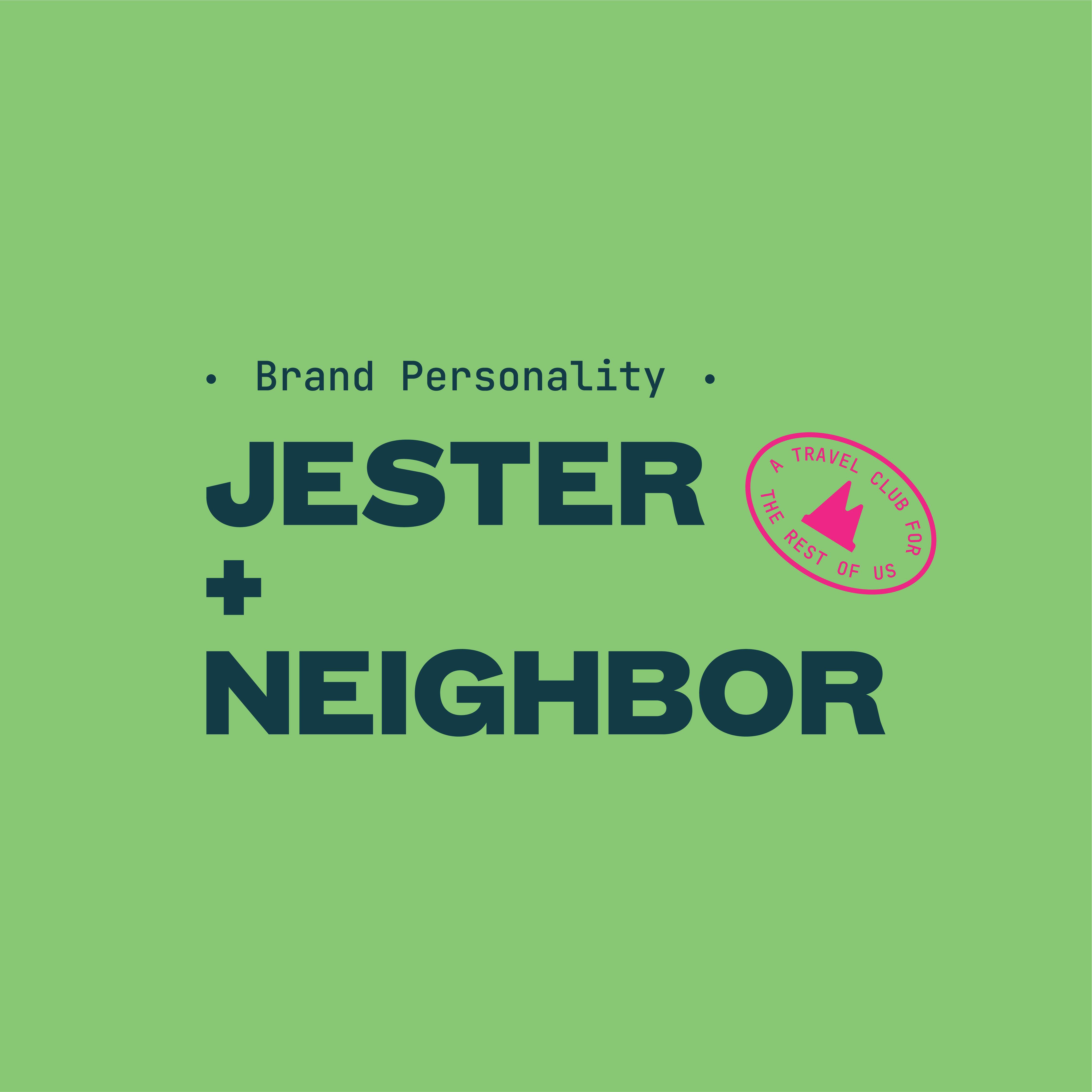
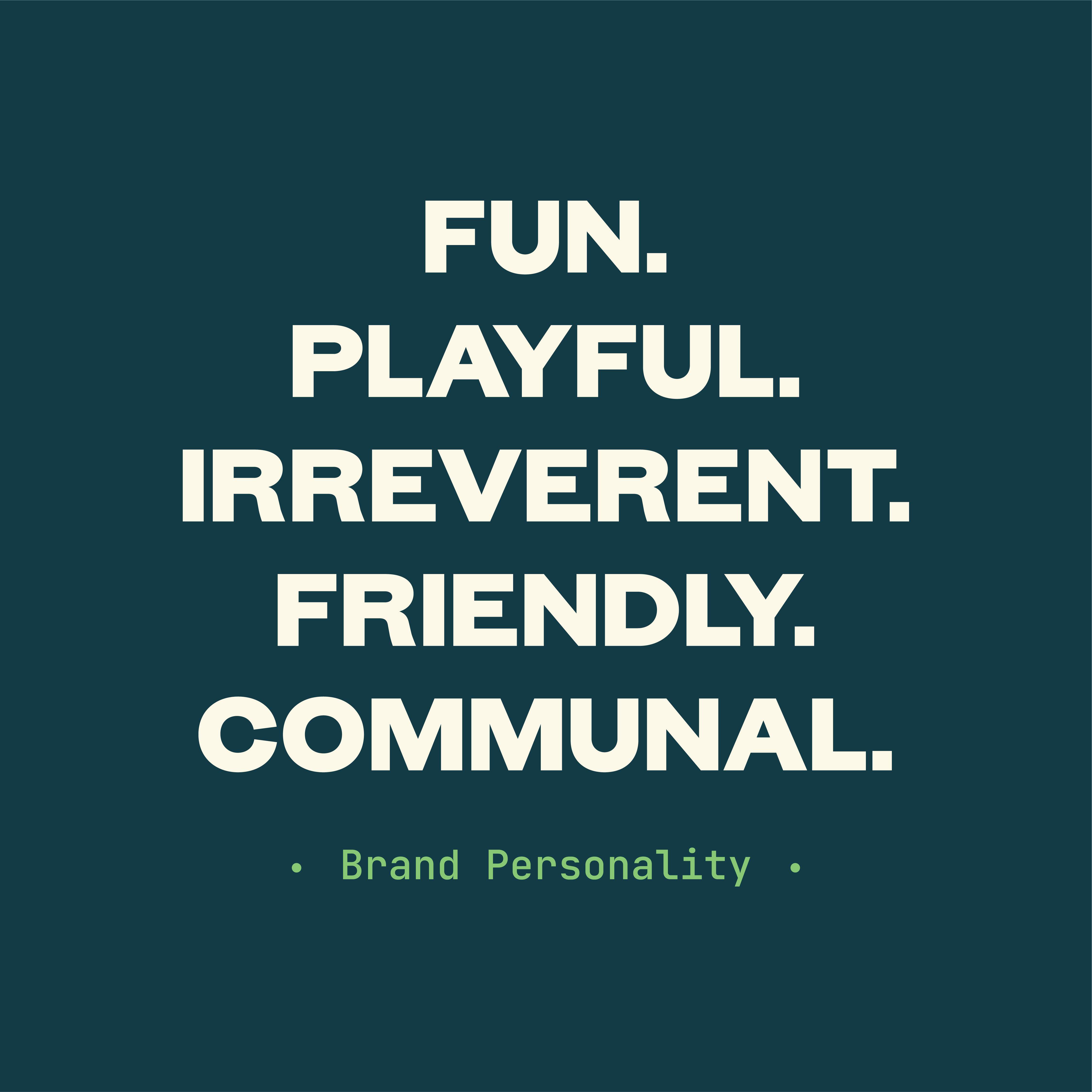
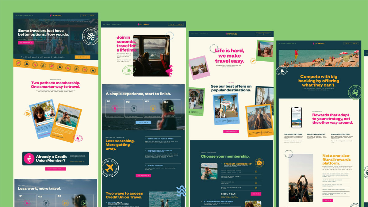
At its heart, the brand identity of CU Travel is accessible, community-focused, and playful. CU Travel asked the question: What is travel to the average person? It’s not just “getting away.” It’s a wife texting her husband, “we should take the kids to Puerto Rico. I just saw this deal!” or a best friend pulling a group trip together with his college buddies. They haven’t been able to align their schedules to see each other in 6 years. What better way to make more memories together than travel? After all, a trip is never wasted when it’s shared, because it’s ultimately an investment in memory, and in relationships.
This attracted a younger audience that typical competing brands do not attract. As a result, we avoided the stuffy “elite” brands and generic “adventure” brands of competitors.
Our strategic theory was to make a brand for younger audiences in order to attract them to credit unions, rather than existing older members. Our rationale? Younger members are the key growth lever for CU Travel’s credit union partners. So we decided to position CU Travel as accessible, yes, but with a very playful twist. This filled a market gap and aligned with the client’s fun, authentic team culture.
You blink, and the kids go from diapers to school. Blink again, and they’re packing for college. Life doesn’t let up. The calendar fills. The costs climb. And the moments that matter, they keep getting pushed. We all say it: I just want more time with the people I love. But in this world, vacation is a luxury. Travel, a privilege. The best chapters of life, the sand-covered kids and the driveway goodbyes, keep slipping further out of reach. They say travel isn’t the problem. You are. In fact it works great for him. You know the guy. His name’s probably Brad. Amex Platinum. Twenty-eight business trips a year. Hotel points out the ears.
But you? You work hard. You save. You wait for summer. And still end up paying top dollar for the same room he gets comped. He flies free to Vegas. You’re just trying to take the kids somewhere without refinancing the house. Because travel isn’t about fun anymore. It’s about your status on the scoreboard. No status? No fun.
That doesn’t sit right with us.
CU Travel is for the family with two incomes and no time. The dad using every PTO hour to make one real memory. The mom scrolling hotel deals, hoping this year’s the year. They’re not trying to game the system. They just want a fair shot at a meaningful trip. So we built a different kind of travel club. Rooted in credit union values, trust, clarity, people first. Then layered in the good stuff: real discounts, real perks, real rewards. Every grocery run, every gas station stop, every Tuesday adds up, not in vague points, but in real dollars toward real memories. Not someday. This year. Because travel shouldn’t be for the ultra-rich or ultra-savvy. It should be for anyone who’s earned it.
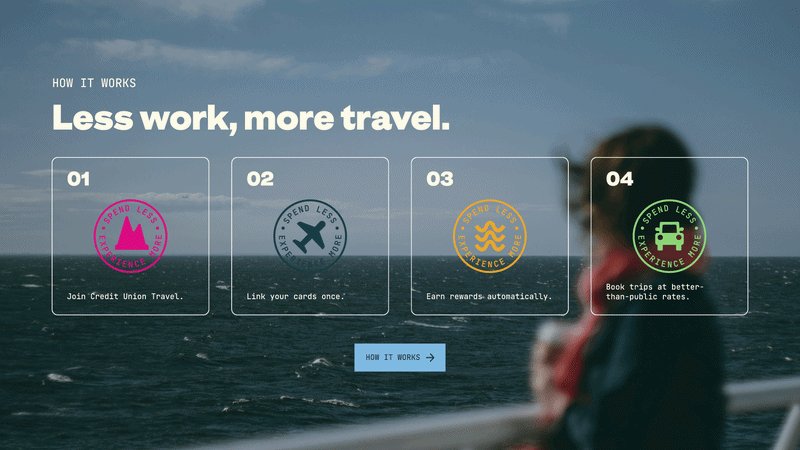
Members save $40–$46 per night, on average. 1.2 million properties. Global inventory. No blackout dates. 5–10% back to spend on hotels. No annual fee for credit union members. No gimmicks. No gatekeeping. Just better travel, made possible by your everyday spending.
The Logo
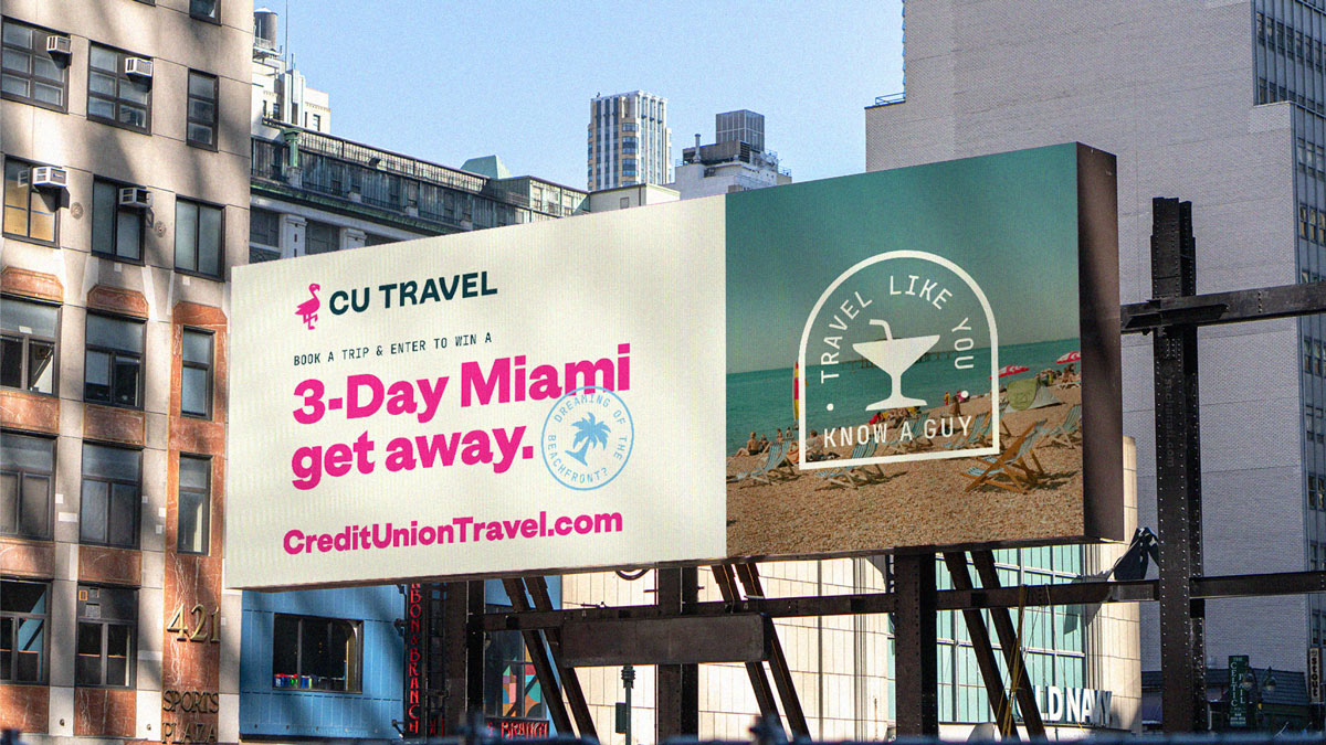
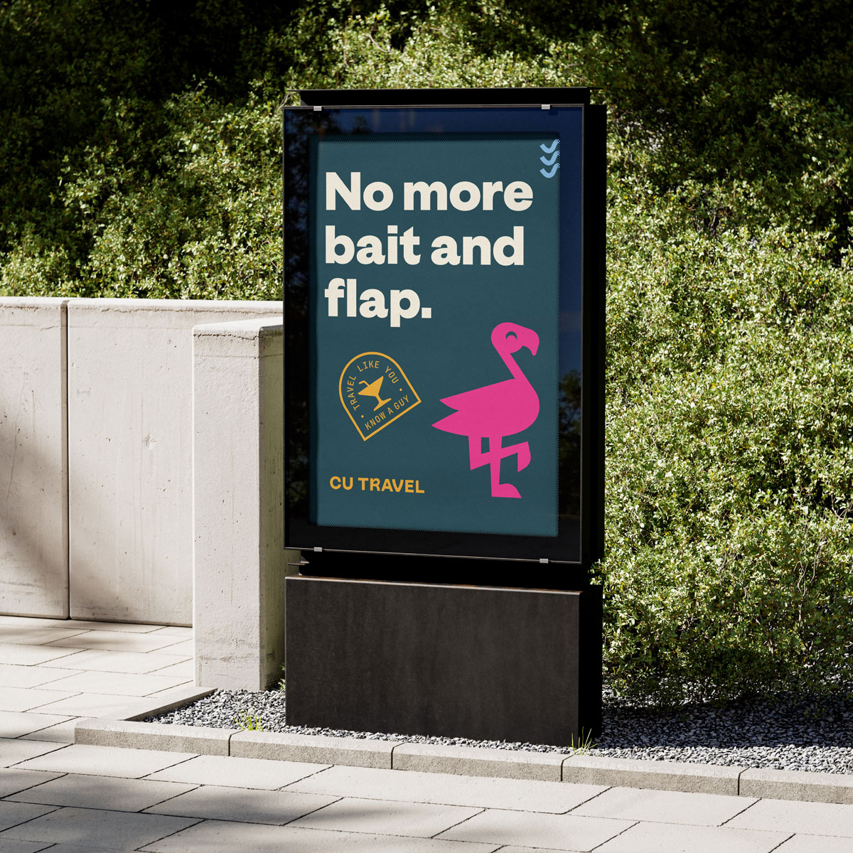
At first glance, CU Travel’s custom drawn logos represent how they do travel differently. For example, rather than looking like every other flamingo design out there, our flamingo proudly leaves the flock and does things differently; just like we do!
Featuring a balance of professionalism and flair, the logotype was inspired by the curvatures and bends that flamingos make with their necks. It was customized to promote adventure while also maintaining composure to continue providing customers with a sense of trustworthiness.
Fonts
Typography is a key asset to the CU Travel brand. It was selected to provide proper contrast, clarity, and character in the overall visual appearance. The Headline typeface is GT Era Display Black. It is clear, bold, and provides a straightforward, attention-grabbing effect. Our Pre-headings, Subheadings, and Body Copy are the JetBrains Mono Family. This was specifically chosen to pay homage to the type found on classic, printed plane tickets..
Colors
The color palette for CU Travel was constructed to invoke feelings of travel, excitement, and adventure in a way that is destination-neutral. The colors effectively promoted a tropical destination and an arctic destination; an urban destination and a rural destination.
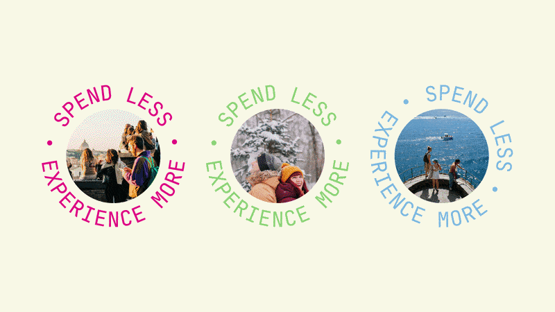
Photography
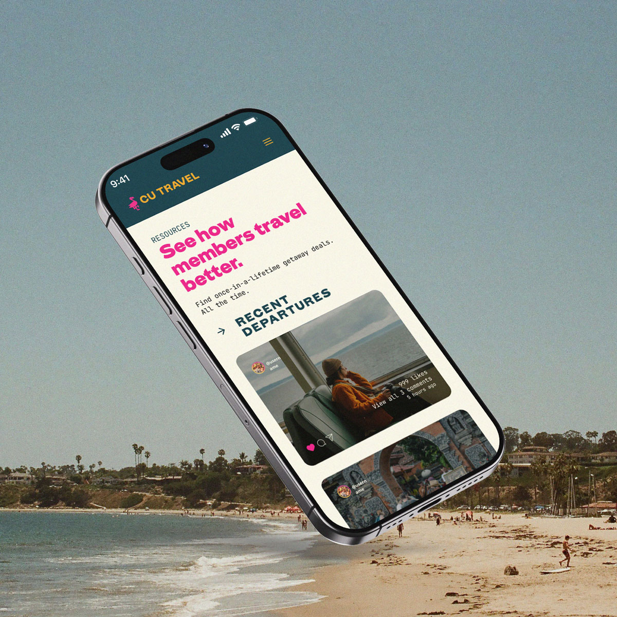
Photography selection was absolutely crucial to how CU Travel was promoted. To build on CU Travel’s existing equity through association with the Credit Union, we used photos that look like User Generated Content—effectively, photos taken by clients themselves, not during a professional photoshoot. Selfies or action shots taken on trips were perfect.
We prize authenticity in our photography. So photos had to be indistinguishable from an authentic social media post with a low following.
Less polished and slightly raw.
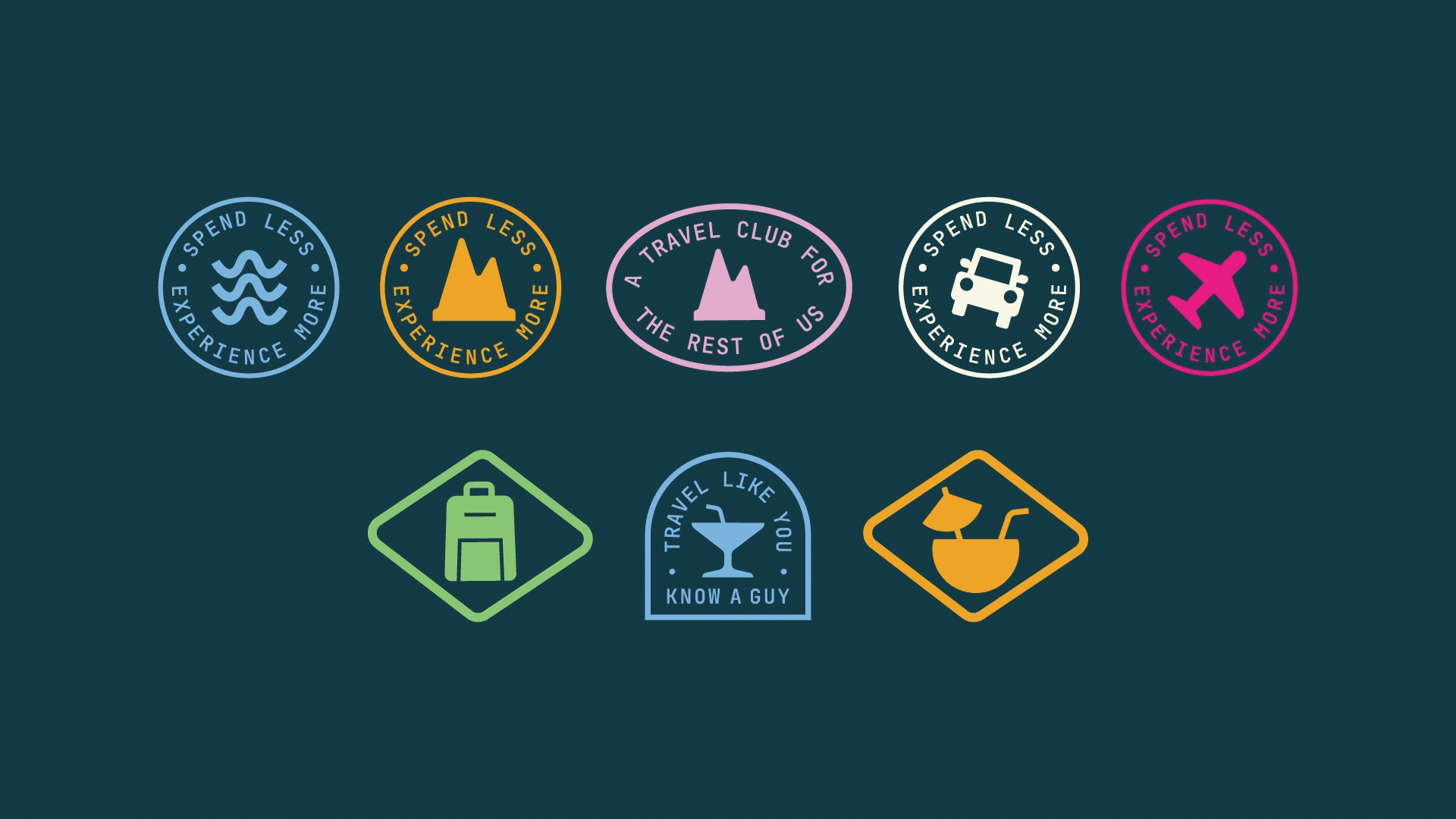
Icons and badges
We created a custom designed icon pack to visually communicate clearly and effectively while promoting the adventure, joy, and fun that CU Travel promotes. Each of these were used by themselves as stamp elements on marketing materials, or as part of a larger system of badges featuring approved tag-lines.
We also created badge features. They included a pre-approved tagline or saying in order to guarantee brand language consistency.
Takeaway
Professionalism and distinctiveness don’t have to be opposed. We pushed CU Travel to embrace its unique culture, avoiding the generic branding of both credit unions and travel competitors.
The result? A highly distinctive brand that stands out, is more emotionally appealing, and serves as a stronger top-of-funnel asset.