Verso Jobs
Heading 3
Lorem ipsum dolor sit amet, consectetur adipiscing elit, sed do eiusmod tempor incididunt ut labore et dolore magna aliqua. Ut enim ad minim veniam, quis nostrud exercitation ullamco laboris nisi ut aliquip ex ea commodo consequat. Duis aute irure dolor in reprehenderit in voluptate velit esse cillum dolore eu fugiat nulla pariatur.
Heading 1
Heading 2
Heading 4
Heading 5
Heading 6
Block quote Block quote Block quote Block quote Block quote Block quote Block quote Block quote Block quote Block quote Block quote
Ordered list
- Item 1
- Item 2
- Item 3
Unordered list
- Item A
- Item B
- Item C
Bold text
Emphasis
Superscript
Subscript
Client
industries
services
The Problem
The pre-seed startup, the earliest stage of venture-backed company funding, needed early traction in order to stand out in a corporate-dominated market. The market is bland, controlled by large, established corporations. Legacy firms set the tone for the recruiting industry. Think sans-serif fonts, bland color palettes, stock photography, corporate jargon, and stiff headshots. The messaging is “punch the clock” —you’re a cog in the wheel of the corporate machine. And what is this machine composed of? Meaningless work and political correctness. Their main competitors were generic tech startups, like Propel, with average, forgettable branding.
The problem? Verso needed to stand out. They needed to demonstrate their conviction in a market flooded with competitors offering similar services with minimal differentiation. The market was saturated with recruiting startups. They all used the same playbook, the same visual aesthetic, the same empty language. Nothing was distinctive.
This meant that Verso couldn’t win on product alone. They needed bold, risky branding to cut through the noise. They needed to stand out and attract both talent and investors.
The Contrarian
Most platforms sound the same. They promise “opportunity!” or “growth!” wrapped in the same polished, politically correct language that America has recycled for decades. Verso made a deliberate choice to do the exact opposite.
Verso’s solution was to position themselves around a distinctly American frontier identity. They decided that Verso embodied the spirit of a person who bets on themselves, rejects the comfortable, and goes in search of something worth building. No more chasing convention.
Verso leaned into a worldview: most corporate culture is theater, startup culture is mediocre, and people worth working with already know it.
This was a thoroughly contrarian move. Brands bend over backwards to avoid alienating anyone. They stretch their arms open, hoping to widen their pool inoffensively. But by doing this, they are like every other generic tech corporation. Verso built its identity knowing that they would inevitably alienate some people. They accepted that cost. It turned out to be their greatest competitive advantage.
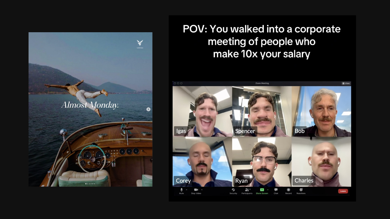
What the Videos Show
Verso’s social identity doesn’t even look like recruitment marketing. It looks like something a sharp, witty, and slightly jaded person at a good startup would send their group chat on a Wednesday afternoon. Their videos mock corporate buzzword culture, meetings where nothing gets decided, and performative professionalism that substitutes actual sincerity. Verso exposes the gap between what companies claim to value and the cautious, inefficient way they actually operate.
The “Braxton” character became a parabolic figure for all of this. Their fictional, Gen Z dropout from corporate life sought something real at a startup. Braxton is direct when corporate culture isn’t and is a do-er while those around him are deliberators. Corporate culture demands decorum but Braxton uses slang. By making Braxton their most popular marketing tool, Verso essentially said, “Yeah, we exist for this guy.”
With videos satirizing most startups along with the big corporations, Verso maintains a brutally honest position. That is, in both the startup and corporate worlds, people are just playing the game. Verso exists for those who won’t. Authenticity is more important than staying safe.
Verso was initially hesitant, and understandably so. Poking fun at corporate culture means poking fun at potential customers. It means standing for something. Taking a side. Accepting that some people will see your content and decide they disagree, or even dislike it.
But that’s precisely what makes it work.
When a brand has no enemies, it also has no true believers. Verso understood that values-neutral positioning wouldn’t build loyalty. It couldn’t. It would only build indifference. By drawing a clear line between the culture they approve and the culture they mock, Verso gave their audience something to identify with and, more notably, something to identify against. This combination is the fuel of the community.
People who resonated with Verso’s tone were already the people Verso wanted to reach anyways. They watched satire, probably chuckled, felt seen, and didn’t get offended. Audiences with these values become the brand’s potential evangelists of their platform. Advocating for Verso becomes advocating for their own worldview.
Who Verso Attracts
The audience profile that emerges is very specific: ambitious, self-aware, skeptical of bureaucratic nonsense, allergic to corporate charade, and on a quest “to the heights,” to find work that feels like it matters. This audience veers toward Gen Z and younger millennials, but the appeal is mainly dispositional. Braxton resonates not because of his age but because of his refusal to perform professionalism at the expense of his honesty.
By attracting this audience, Verso created a social phenomenon. Their content racked organic viewers because it was true to something. In a corporate line saturated with sameness, truth is the rarest differentiator of all.
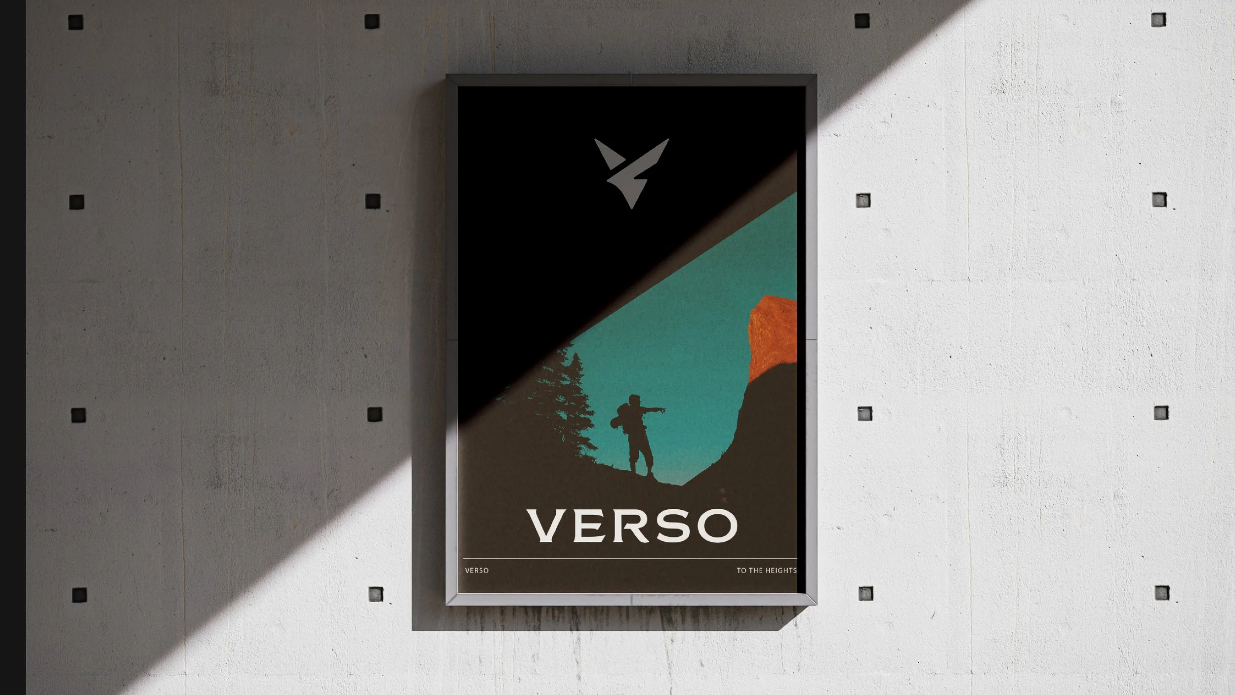
Built Different. Verso’s Visual Identity.
Verso is a nostalgic, frontier-inspired brand. Sherwood reinforced this position through their brand’s visual aesthetic. In a startup world dominated by minimalism, pastel gradients, and the same five Canva templates, Verso looks like it was built by people who actually read history books.
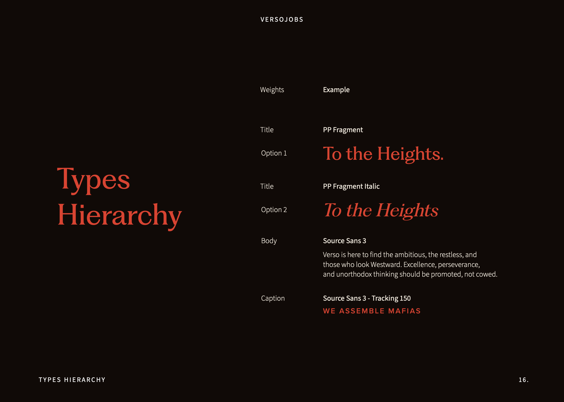
Typography
Verso’s typography balances classic refinement with bold modernity, rejecting the uniformity of typical tech branding. PP Fragment brings an elevated, almost editorial sophistication, evoking legacy, ambition, and distinction. Paired with the compact strength of Source Sans 3, the typography signals confidence, urgency, and a break from the homogenized, egalitarian aesthetics of modern startups—a brand for pioneers, not followers.
Logo
The Verso logo doesn’t actually look like a startup logo. It looks like a mark. The sharp, angular shape forms a bold “V” for Verso. Clean. Confident. Ownable. At the same time, the stylized eagle implies something further than a mere letter. The eagle is one of America’s oldest symbols of excellence and daring, and Verso uses it without irony. This is a brand that believes in the pioneer spirit earnestly, and the logo says so.
Finally, the subtle compass rose embedded in the mark adds a layer of meaning for those with a sharp eye. Direction—finding it, choosing it, committing to it— guides both talent and companies toward their true potential. The compass is the Verso mission statement hidden alongside the eagle.
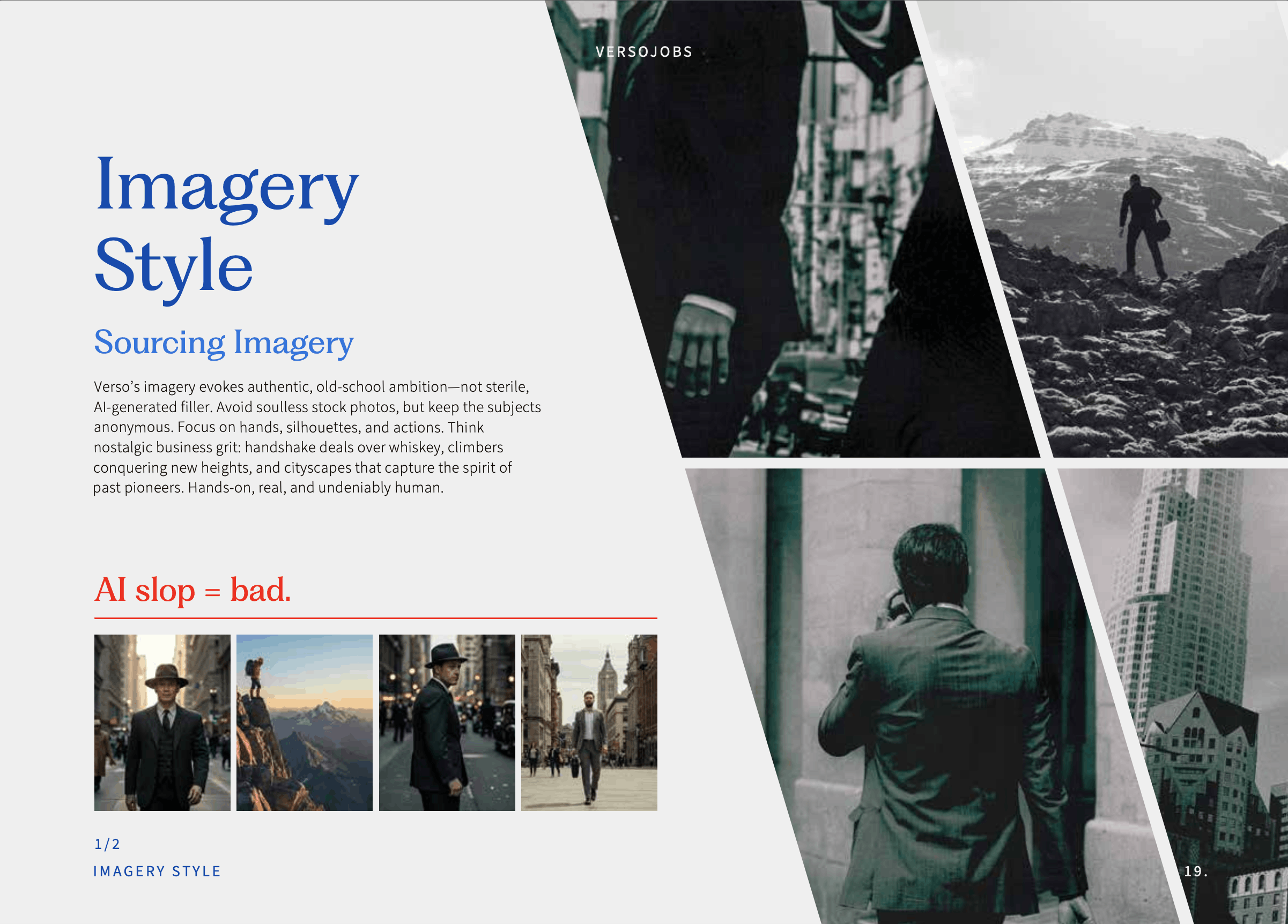
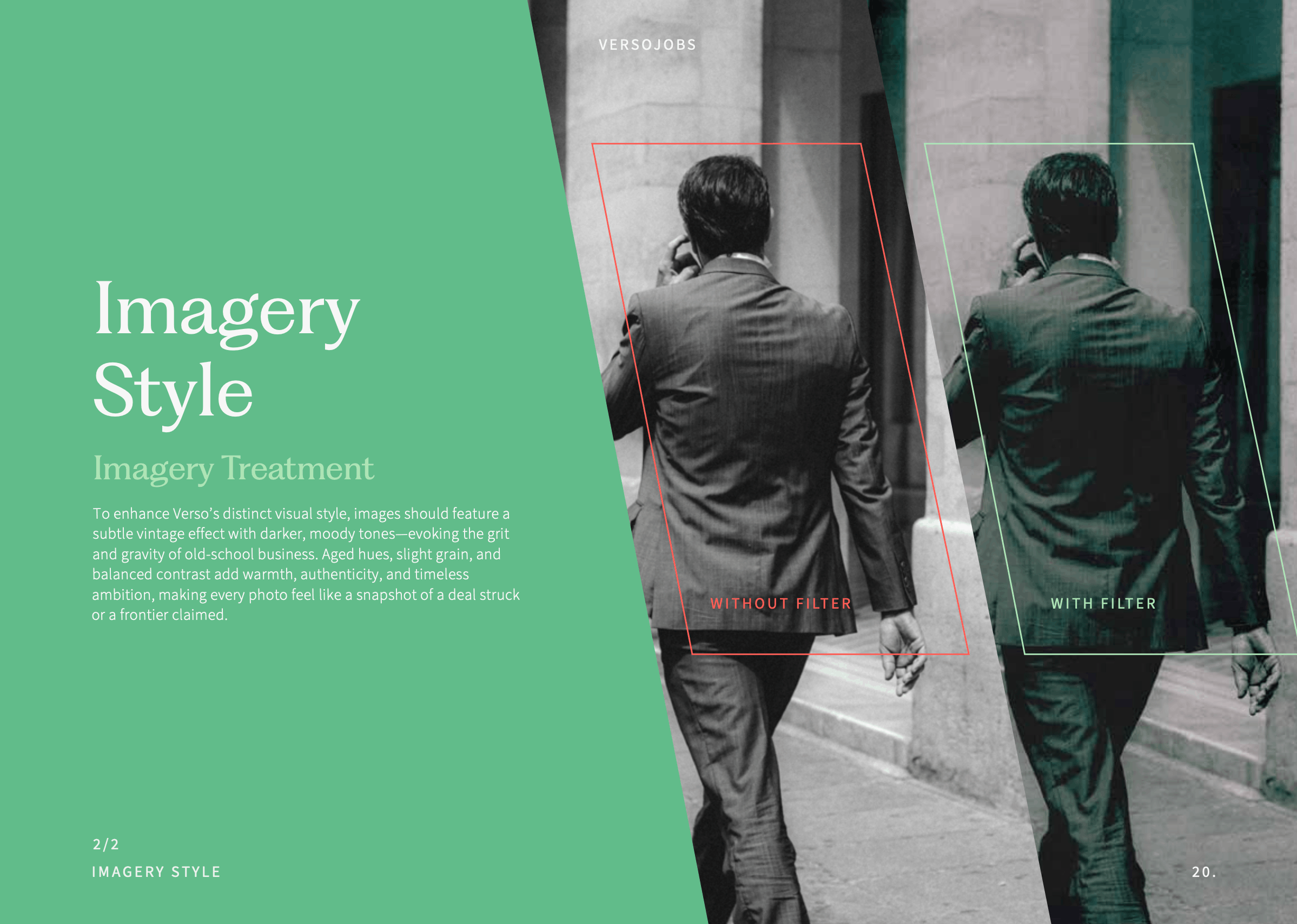
Imagery
Verso’s creative direction for photography and imagery is best understood by that which it refuses to do. No soulless stock photos. No AI-generated fillers. No smiling strangers shaking hands in front of glass buildings. Instead, Verso’s visuals are focused on hands, silhouettes, and action.
The references themselves are deliberately nostalgic: handshake deals over whiskey, climbers pressing to a new height, and cityscapes that capture the spirit of past pioneers. Hands-on, real, and undeniably human. Nostalgia here functions as a values statement. Verso’s imagery says that the qualities that made great builders haven’t changed, even if the tools have.
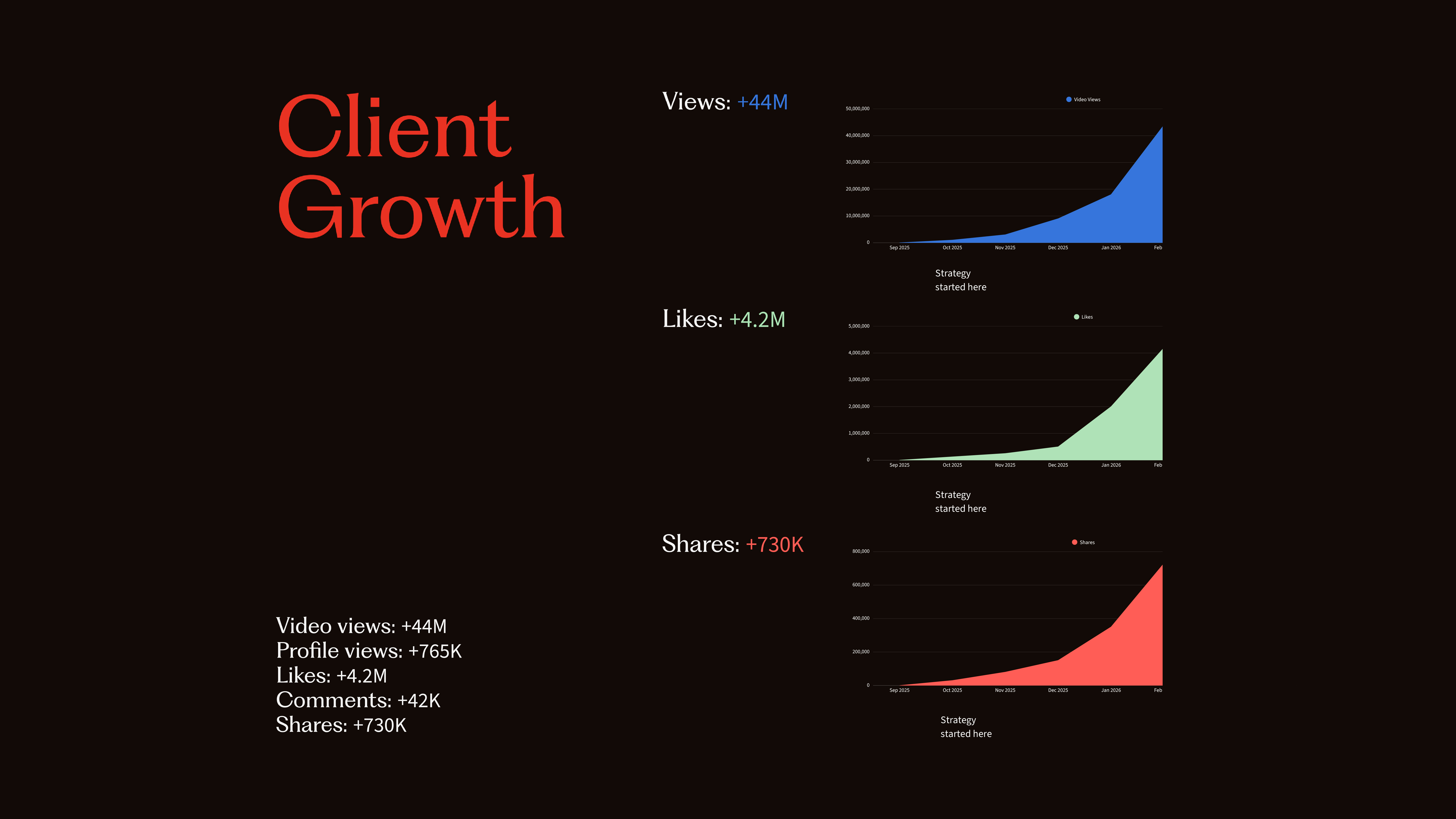
The Results Speak For Themselves
Verso proved that taking a risky, convicted stance is the path to success. They gained immediate traction. They started new conversations and doors began to swing wide open on Twitter and LinkedIn. The numbers don’t lie.